By Sean Tinney June 12, 2024
If you’re trying to convert your website visitors into customers, you need to convince them to take action. That’s why you can’t afford to ignore these call to action (CTA) best practices!
After all, a well-crafted CTA can make all the difference in getting users to fill out your email sign up form.
Better yet, once your email list starts growing, you can continue using calls to action to move subscribers through your marketing funnel.
So, to help you make the most of your opt-in form — and all the other work you put into your email messages — we’ve rounded up the 10 most important call to action best practices.
What is a call to action?
A call to action, or CTA, encourages your website visitors, leads, and customers to take a particular action.
For example, you might direct users to:
- Subscribe to your newsletter
- Download a resource
- Sign up for a webinar
- Make a purchase
An effective CTA should stand out to attract a user’s attention, often taking the form of a:
- Link
- Button
- Banner
- Pop-up
To really maximize the number of visitors you can convert into leads or customers, you’ll want to ensure you’re following call to action best practices. We’ll discuss these in depth later on.
What is the purpose of a call to action?
The purpose of a call to action is to align your marketing and business goals.
By prompting users to take a specific action, you can entice them to move along your marketing funnel.
Let’s take a look at how CTA’s can influence a users’ journey along your funnel.
For example, if you follow SEO best practices for blogs, a user may find your website through an organic search result listing.
You can include a call to action in the article which encourages the user to sign up for your email newsletter.
From there, you can send the user emails addressing their pain points and interests.
For instance, you may send an email with a CTA directing them to try out a free tool or resource you’re offering.
Once you’ve nurtured a relationship with the user by providing them value, you can consider trying to convert them into a customer.
To do this, you could create a sense of urgency by sending an email with a call to action to purchase your product with a time-sensitive discount code.
Finally, once you’ve converted them into a customer, you may want to send an email asking how they like the product.
Once again, you can include a CTA prompting them to leave a review.
As you can see, incorporating call to action best practices in your messaging is critical to moving users along your marketing funnel.
10 call to action best practices
Now that you understand the importance of crafting an effective CTA, let’s look at some call to action best practices.
By following these best practices, you’ll be able to direct users to take the action you want them to.
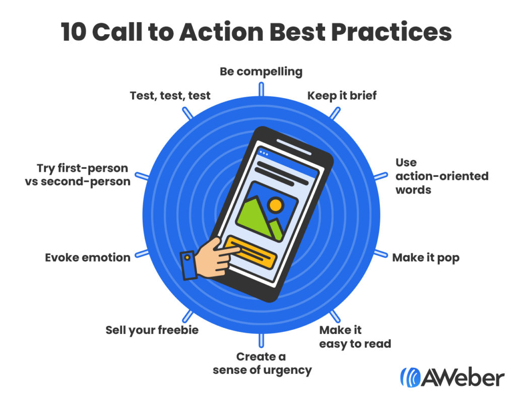
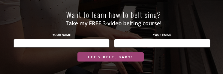
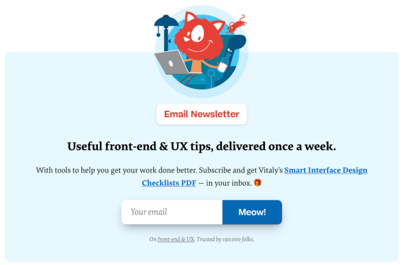
1. Be compelling
“Submit” or “sign up” are a little 2017. To really stand out and engage your site visitors, use copy that stops people in their tracks. Don’t be afraid to have some fun with it.
Vocal coach Felicia Ricci decided to have some fun with her CTA. Check out this distinct and inviting call to action button copy that ties in directly to her course.
Or here’s Smashing Magazine’s irreverent take on button copy. It seems almost a bit too far… until you read the line below about them having 190,000 email subscribers. This may not work for every audience, but for them, it’s spot on.
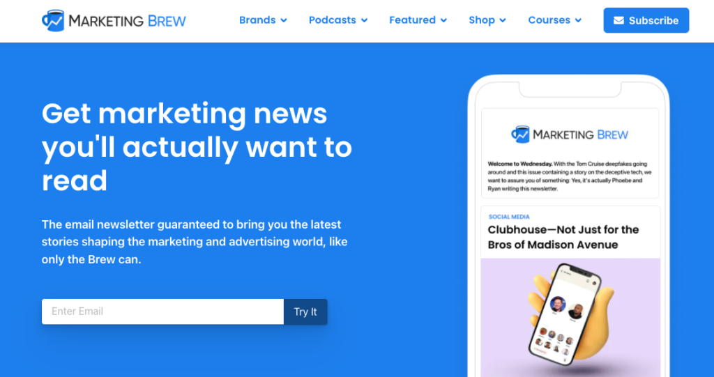
2. Keep it brief
If it takes too long for prospective subscribers to read your CTA, they may lose interest in signing up for your email list.
Attention spans online are ridiculously short, so make every word count. That’s why one of the most important call to action best practices is to keep your CTA brief.
How many words should a call to action have? The general rule is two to five words.
This doesn’t mean you can’t break this rule and use a one-word CTA or even a 12-word CTA, but two to five words generally works best. If you want to break the rule, have at it, but consider running an A/B split-test to test your copy. (More on that in a moment.)
Here’s a two-word call to action from the newsletter giant Marketing Brew.
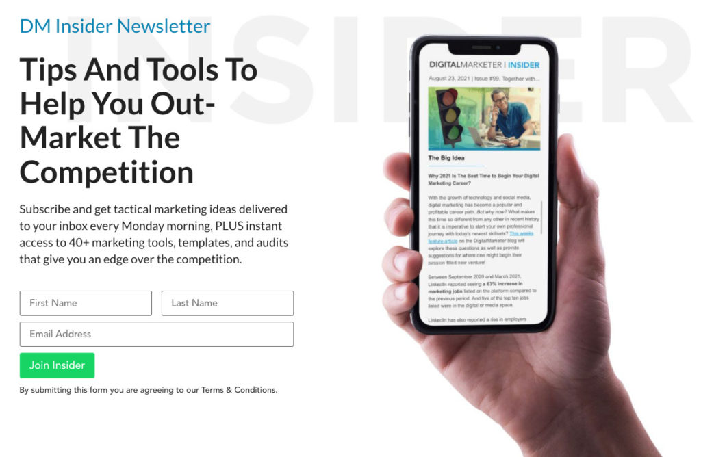
And another two-word call to action from the marketing masters at Digital Marketer.
3. Use action-oriented words
3. Use action-oriented words
Incorporating call to action best practices is all about getting people to take action, so use some sort of actionable word or phrase.
Even “submit” gives readers a next step to take. So, make sure your CTA is focused on the action you want your readers to take.
Think of your CTA as an urgent, brief message. Ask yourself:
- What do you want them to do?
- How do you want them to feel when they do it?
Find a verb that captures that experience. Here are a few examples of verbs that are proven to get people to click:
- Get
- Book
- Send
- Download
- Start
- Try
- Reserve
- Take
- Upgrade
- Explore
- Save
- Go
- Give
- Grab
- Create
- Upgrade
- Join
- Claim
- Contact
- Subscribe
That last one—subscribe—might seem a little old school. But some very successful sites use it.
For example, take a look at the Exponential View newsletter:

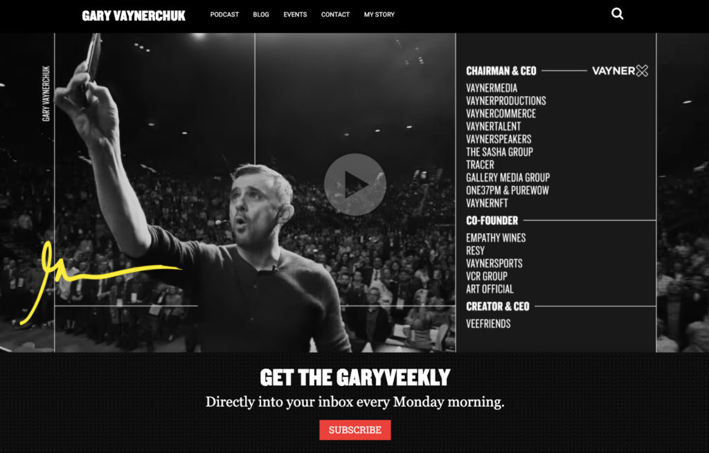
Likewise, here’s an example from expert entrepreneur Gary Vaynerchuk:
4. Make it pop
If you’re looking for ways to make your CTA stand out, then experiment with the color. The color of your CTA should draw your potential subscribers to it.
Color has been shown to impact subscribers’ behavior, and there is a close link between colors and emotions. Warmer colors—like pink—evoke completely different emotions than cooler colors, like steel blue.
There’s no hiding from Backlinko’s green call to action button in the example below. The contrast between the button color and the rest of the page is striking.

5. Make it easy to read
There are two parts to successful CTA formatting and design best practices.
First, use a font size large enough that people can read the button copy on a mobile phone, and even in bad lighting.
Don’t make anyone squint to see the CTA!
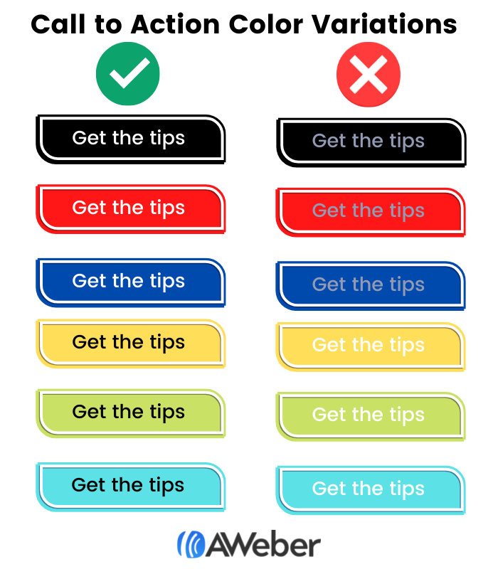
The second part of making the call to action easy to read is using enough contrast between the button text and the button color.
For example, when using a darker colored CTA button color, the text should be a lighter color. Likewise, when using a lighter colored CTA, your text should be a darker color.
We recommend white text for the darker color call to actions and black text for the lighter color CTAs.
Check out the examples below to see how light on light and dark on dark almost blend into the background.
Remember: Your CTA tells your potential subscriber the action you’d like them to take, so don’t hide it!
6. Create a sense of urgency
When it comes to emails, we often encourage our readers to create a sense of urgency in their subject lines. Unsurprisingly, this is also a key CTA best practice.
Adding words like “now” or “today” can prompt people to take action immediately. Very few of the people who see your sign up form will remember to sign up for your list later. You want them to take action now.
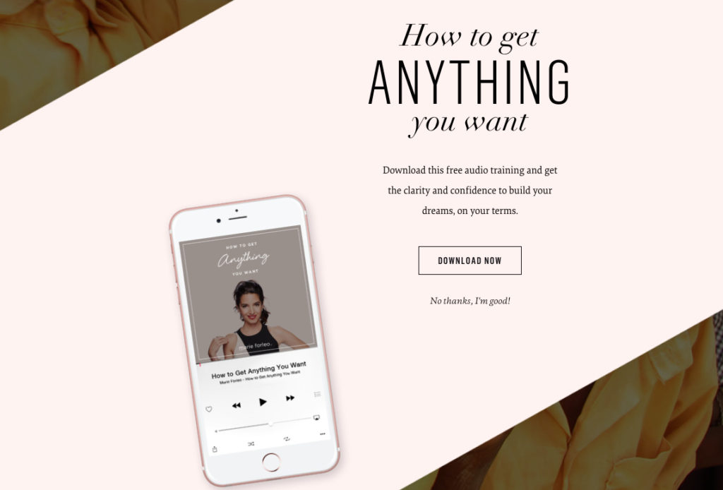
Marie Forleo’s opt-in box follows this CTA copy best practice well, and it’s backed up by a killer incentive. After all, who wouldn’t want to get anything they want?
You can also create a sense of urgency by providing time-sensitive offers.
For example, if you want the user to buy your product, consider including a discount code that expires the next day.
7. Sell your freebie
Many email list owners offer a “lead magnet” or a “freebie” to entice people to sign up for their mailing list.
This is usually an ebook, but freebies can also be:
- Exclusive videos
- A free course
- Anything your ideal subscribers would find irresistible
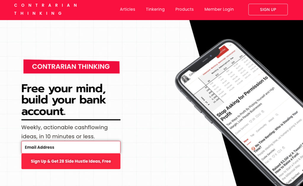
Here’s an example of an opt-in form with a lead magnet from the newsletter Contrarian Thinking. It offers an ebook called “28 Side Hustle Ideas.”
Also, consider summing up the value of your lead magnet in one word. It sounds like a tough challenge, but it can be done.
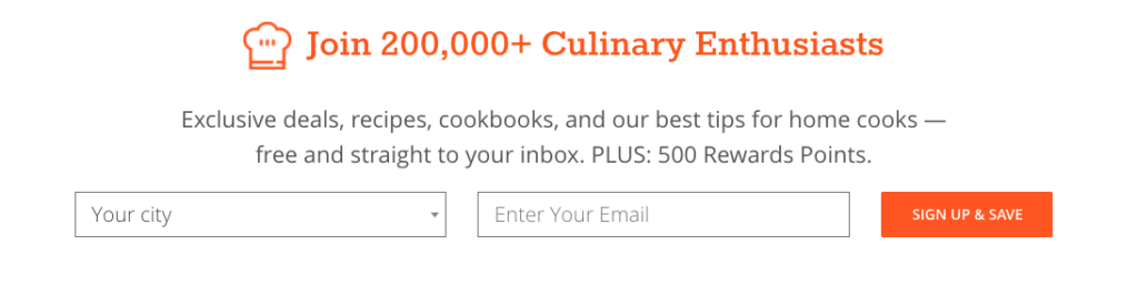
For example, take a look at the call to action copy from CozyMeal.com. Their one-word benefit summary is “save.” With a list of 200,000 subscribers, clearly that copy works.
Another secret to selling your freebie is to make sure people know exactly what they’re going to get–even if you have to tell them twice.
While your opt-in box should explain what people will get when they sign up, consider repeating it in your call to action. Test out highlighting the benefits in your form button.
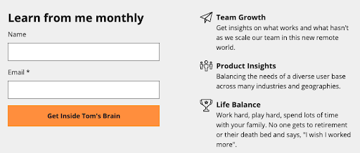
Here’s how our Founder Tom Kulzer did this on his personal site. Not only is the CTA unique and fun, but it clearly articulates what a subscriber can expect from his emails.
8. Evoke emotion
Great marketing is all about tapping into emotion. You want your audience to feel a certain way, and your copy is the place to do it.
This is one of the most powerful best practices for a CTA–or any copy for that matter.
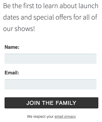
For instance, Fable & Folly Productions is all about community, and they want their website visitors to feel like they’re welcome. Check out their unique call to action copy in their sign up form below.
Or, consider this call to action copy from Lewis Howes. Those six little words will invoke strong feelings for his ideal readers.

9. Try first-person vs second-person
It’s natural for marketers to write to their audience in the second person, where the reader is addressed as “you” or “your.”
Marketers often use this point of view because it speaks to the individual, as opposed to a mass audience.
As a result, it feels more personal to the recipient. It also forces you to present the value of the action you want readers to take.
For example, this whole blog post is written in the second person perspective in order to encourage you to test new CTA copy so you can get more subscribers. We often write our calls to action that way, too.
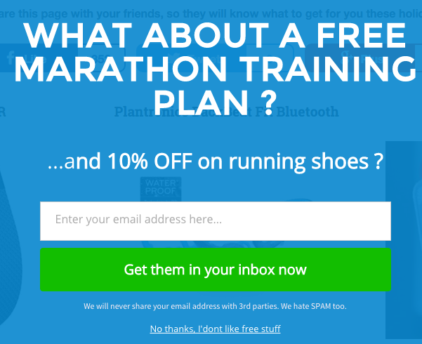
In the form below from Running Shoes Guru, you’ll notice the CTA button is written in the second-person perspective:
But you may also want to test out first-person language (“I”/”we”) on your sign up form. This can help your visitors feel a sense of ownership of your offer.
Plant-Based Juniors, a blog about feeding children a plant-based diet, tried out first-person language on their guide’s landing page:

10. Test, test, and test some more
Call to action button copy best practices are great, but they have one fatal shortcoming: they generalize. So, while everything we’ve told you about here is proven to work, it’s not specific to your audience.
The only way to really know what will work best for you is to test.
Fortunately, testing isn’t hard to do. There’s a simple method to test different versions of button copy, or anything else on your sign up form. It’s called an A/B split test.
An A/B split test lets you show two or more versions of your sign up form to visitors.
The two variations rotate dynamically, so half of your visitors will see “Version A” of your form, and the other half of your visitors will see “Version B.”
When enough people have seen both versions of the form to produce statistically valid results, then you can tell which version of the form (or button) converts best.
If your first test fails, don’t be discouraged. Just try something different. Sometimes it takes a few tests to find the perfect call to action.
You can always learn from a test–even one that doesn’t win.
Remember: Persistence will pay off!
After all, what would getting even 20% more email subscribers mean to you?
Better yet, that’s 20% more subscribers without having to drive additional traffic, create any new content, or do anything extra at all besides the test.
By testing various call to action best practices, your form could generate more results for you.
Best practices for placing your call to action
Where you place your CTA could impact how many email subscribers you collect.
Why? If nobody can find it, then there’s no way you’re going to collect their email addresses.
So, here are some of the best practices for placing your calls to action in highly-visible spots on your website.
At the top of your website
AWeber customer, RealEstateAuction.com, has a call to action you can’t miss.
It’s right at the top of every page on their website, and the button is fire engine red. This makes the CTA easily accessible and highly visible.

In the sidebar of your blog posts
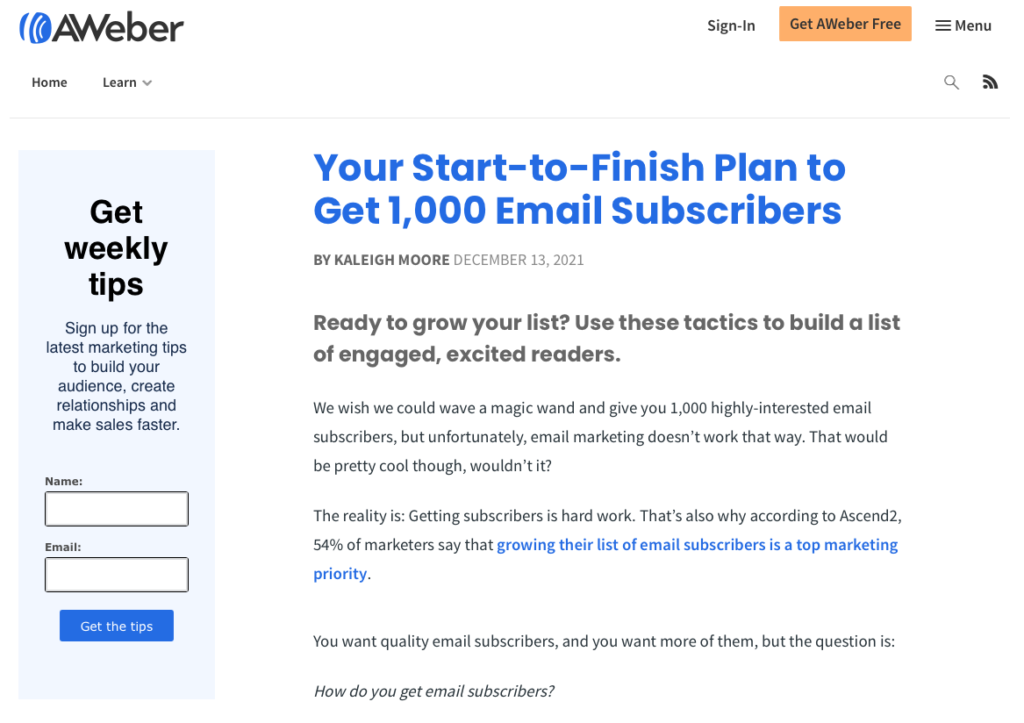
Did you notice that every AWeber blog post has our email sign up form in the sidebar?
Like the previous example, this makes the CTA easily accessible.
Additionally, it follows other call to action best practices, like clearly explaining the value of the newsletter and using action-oriented language.
As a pop-up message
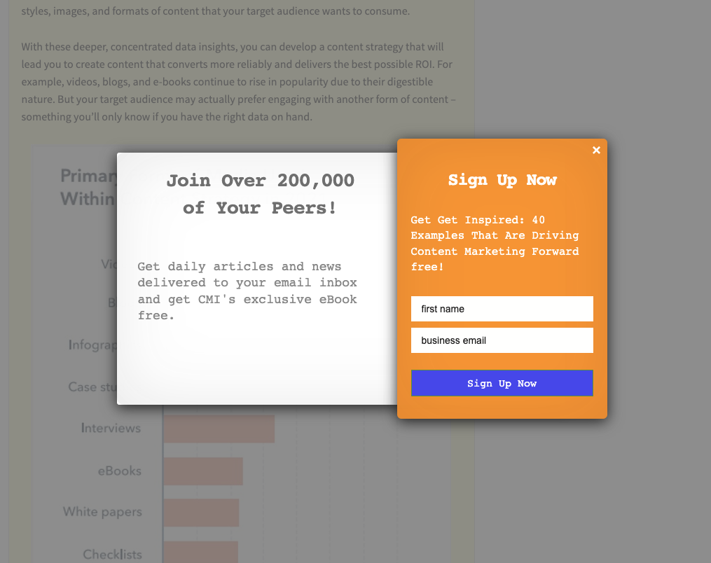
The Content Marketing Institute has a pop-up appear once you begin scrolling through one of their blog posts.
This ensures you can’t miss the CTA, since you’ll need to either sign up or close the prompt box to continue reading.
They also incorporate call to action best practices by using social proof. It’s clear that if you sign up, you’ll be joining a robust community of like-minded professionals.
In the middle of your blog post
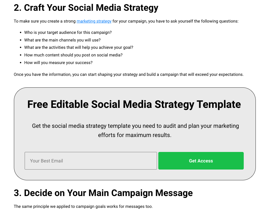
Check out how SocialBee includes a lead magnet to capture email addresses in the middle of their blog post.
This call to action offers readers value that’s relevant to the blog post they’re reading.
After all, if users are reading an article discussing social media strategy, they’ll likely be interested in a free template to help them craft their own strategy.
Once the reader enters their email to get the lead magnet, SocialBee can begin nurturing those leads to convert them into customers.
Call to action phrases to try right now
As we discussed earlier, using action phrases is a critical best practice for calls to action.
So, are you ready to improve your call to action button copy? Want to swap your current call to action with something new?
Here are 20 call to action phrases for inspiration:
- Gimme
- Snag this offer now
- Don’t miss out
- Let’s go
- I want free _____
- Let’s do it
- Get it
- Get the guide
- Send me the goods
- Get the discount now
- I’ll take it!
- Enroll
- I can’t wait any longer
- Join the tribe
- Yes, please!
- I’m in
- I’m here for it
- Try it
- Save my spot
- Get the tips
How will you use these call to action best practices?
We’ve given you a lot of inspiration for how to write call to action button copy and how to use cta best practices.
Hopefully, you’ve got a few ideas for what to write. Give it a try and tell us about the results you saw!
If you want even more ideas for how to create better call to action copy, see this post on how to create killer CTAs for your sign up form.
Finally, once people start signing up, check out our email marketing tools. Our features can help you craft the perfect marketing emails in no time, so you can convert subscribers into customers!